Challenge: Studies show that the overwhelming majority (77%) of the formerly incarcerated will be re-convicted within 5 years. Inability to find stable work is often cited as a key factor in re-offending.
Solution: My goal was to provide the formerly incarcerated with coaches who will help them find stable employment and assist with re-integration into regular society, reducing the rate of re-offending and repairing broken lives.
Duration: 5 weeks
Software: Adobe XD
Due to the inability to find members in the community that fit the target audience, (formerly incarcerated), a combination of research was done regarding challenges that the formerly incarcerated face during release from imprisonment.
A variety of second hand research was done, including gathering case studies, surveys, and statistics from government websites. Research was concentrated on re-entry programs offered, probability of receiving job interviews, and average incomes for the formerly incarcerated. The assumption was that all these factors will play a contributing factor in the rate of re-offending; an assumption that was later confirmed.
In-depth research quickly revealed that NewLeaf was a unique proposition (online career coaching for the formerly incarcerated). The closest competitors were in-person services that provided a variety of services that helped the formerly incarcerated stay out of prison. Two such services are Project 180 and Prison Fellowship. However, neither provide online services and only operate within their general area.

I had created a few personas for this app, just to get an idea of who I’m targeting.
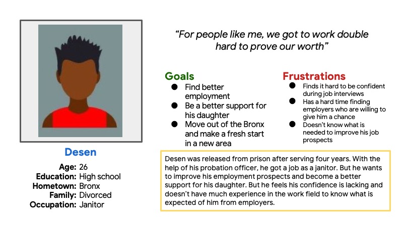
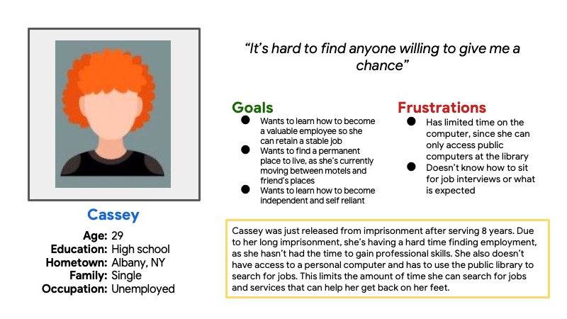
All of my ideas during the ideation exercise centered around the sign up process. The question was deciding how much information was needed on the home screen.
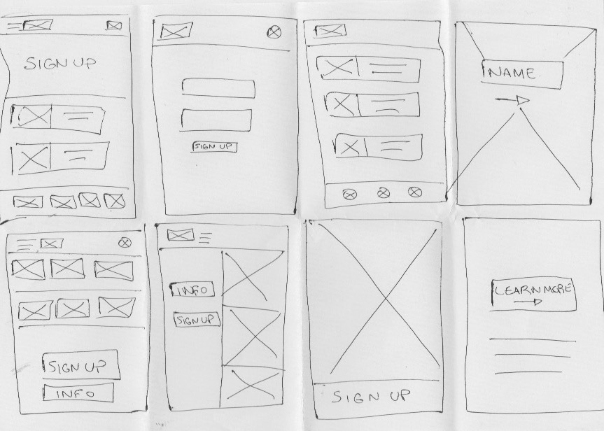
I thought it would be a good idea to make the sign up process for the mobile app prominent, since that was the most important feature.
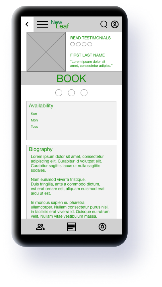
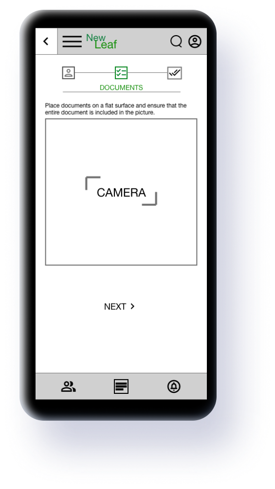
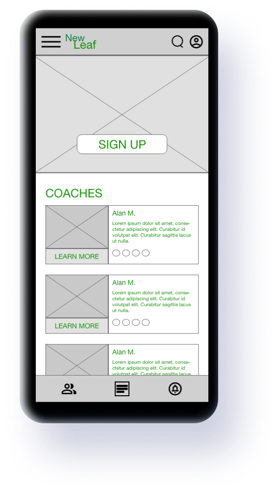
The initial wireframes were too busy and I finally decided to remove the hamburger menu as it was unnecessary for the mobile app. The bottom menu bar also went through some modifications to make the options more obvious.
With those changes in mind for the mockups, I went ahead and created the lofi prototype.

Now, it was time for the mockups. Feedback from users indicated that the home screen was too busy. After some discussion, a few changes were made: the coaches list was first removed and then extra buttons, such as What We Do and the hamburger menu were removed. I determined these were unnecessary for the mobile app.
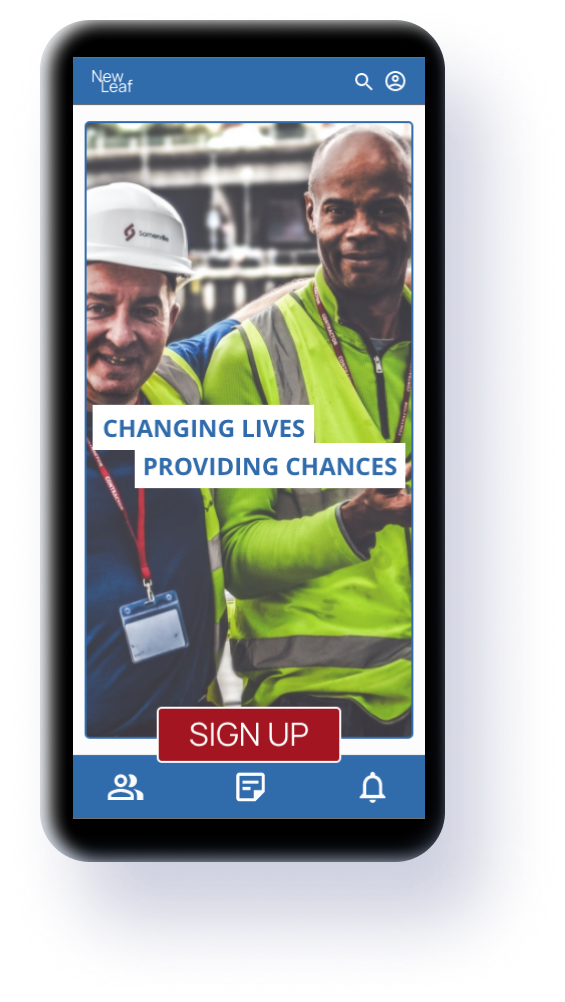

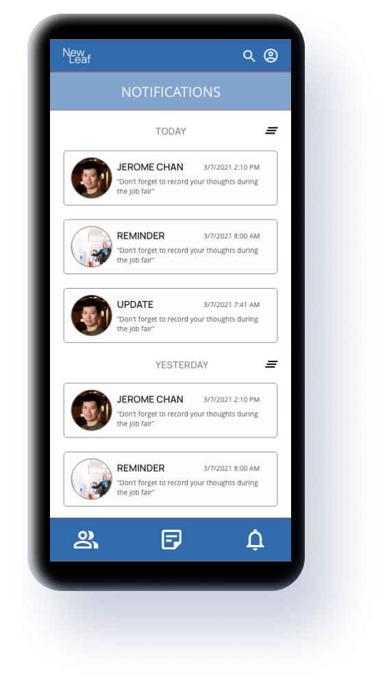
In the finalized version of the mobile app, the home screen was simplified, the sign up progress bar better highlighted and the hamburger menu was removed.
For the responsive website, I first concentrated on the sitemap. The layout and information structure would be basaed on that.

Less emphasis was placed on the sign up process. The focus was on the organization itself, what it offers and the call to donate.
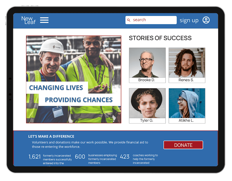
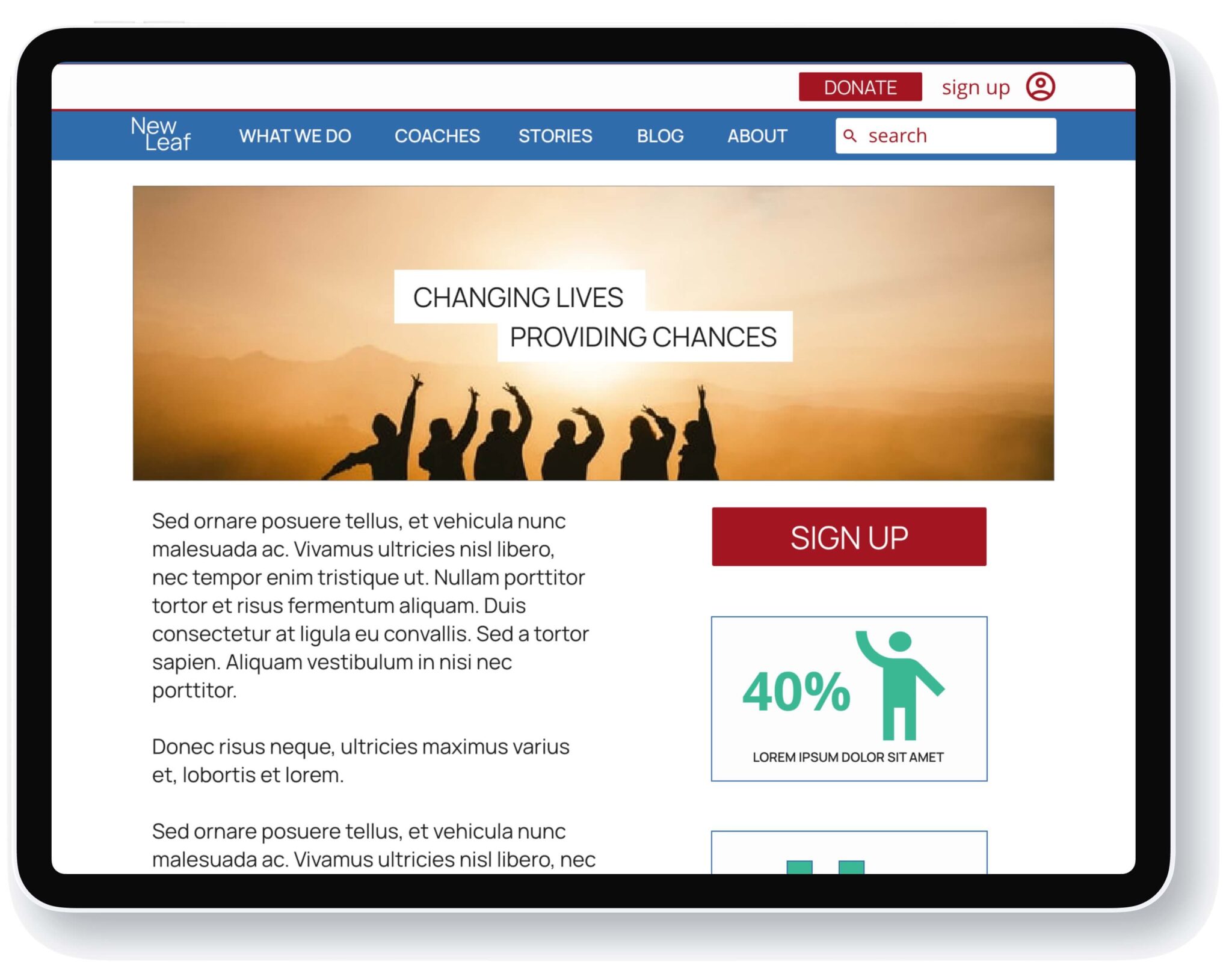

One of the most important lessons learned during this project was that the device really does determine the content. For the mobile app, it became quite apparent that design needed to be simplified and focused on one aspect, as participants didn’t have time to sit and browse around. But once I moved over to the responsive web design, I was able to expand on the content and change the focus.
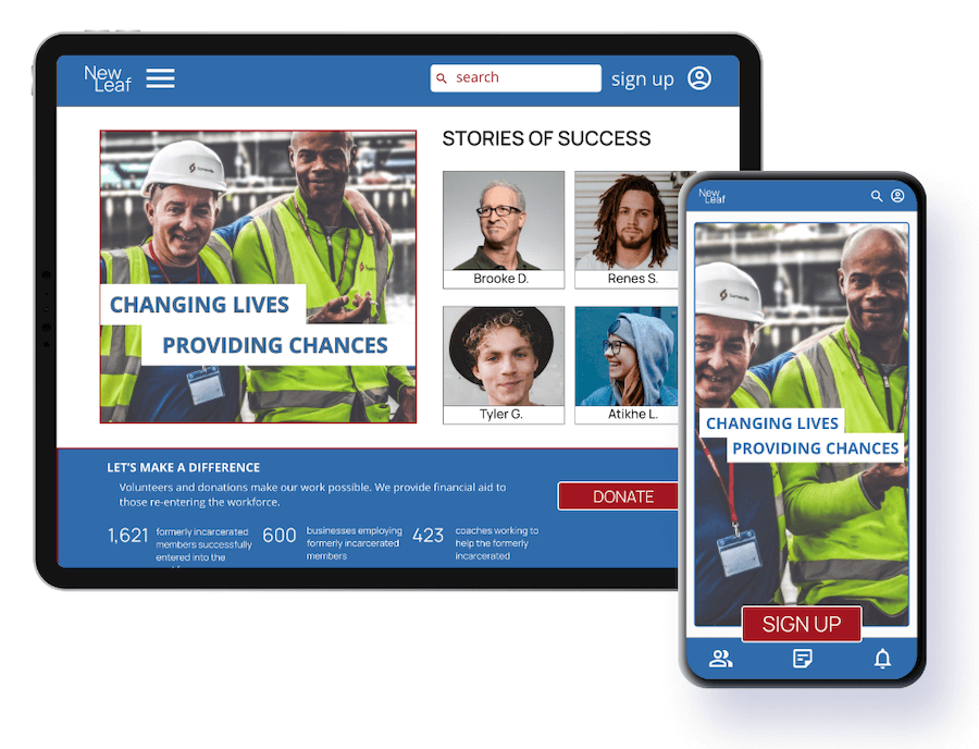
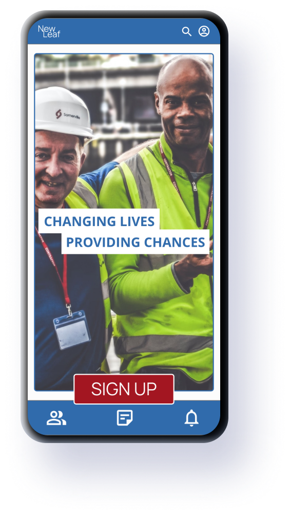
Website, tablet & Android/iOS app
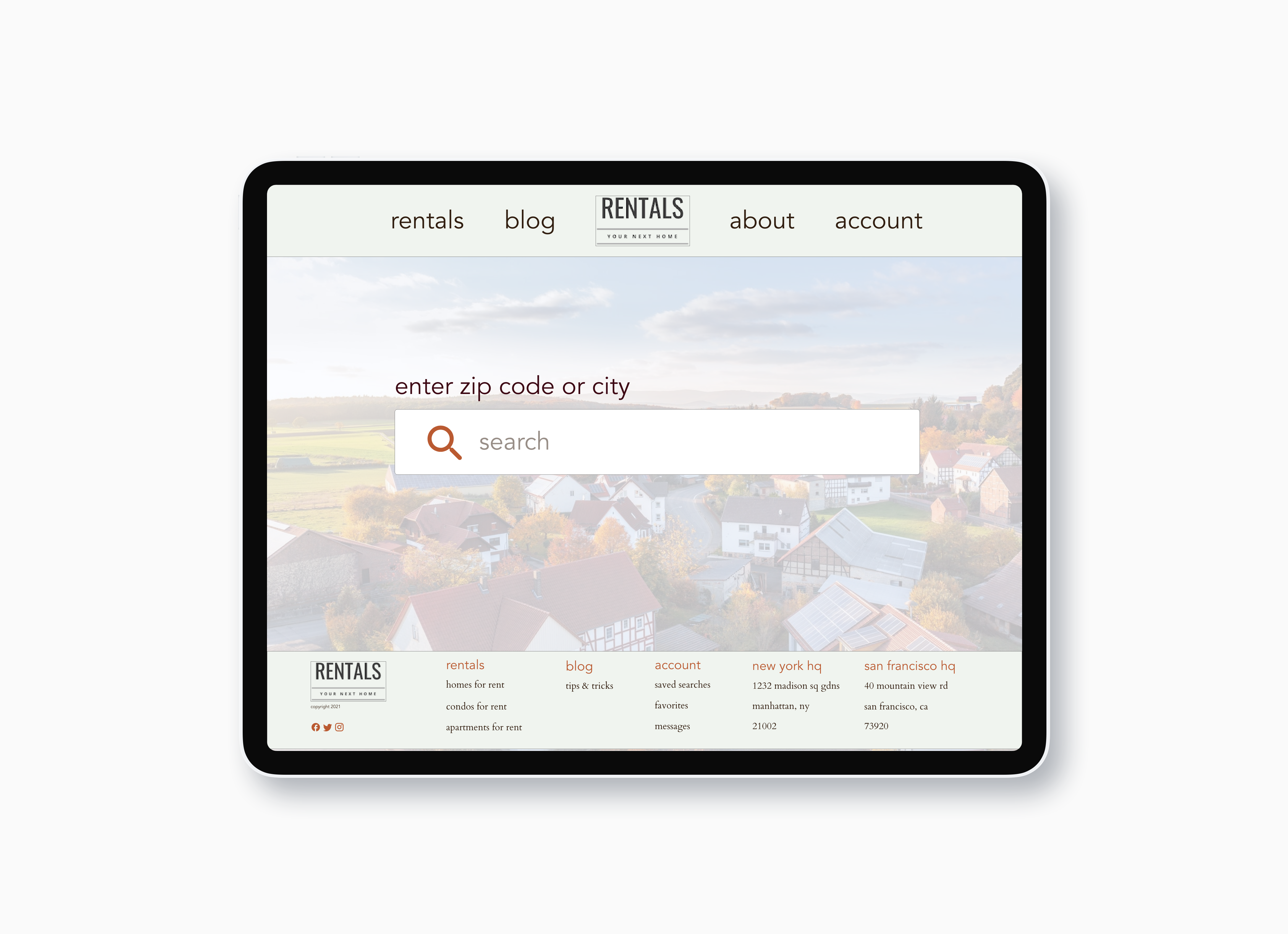
Website & tablet
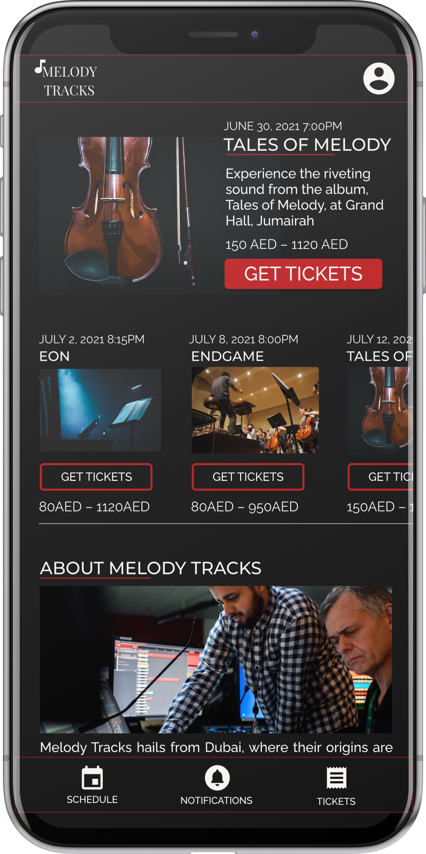
Android/iOS app