Challenge: Users in Maryland want a one-stop shop to view and reserve rentals in their general area
Solution: Build a responsive website where users can view rental properties (homes and apartments), set up viewing appointments, and submit documentation for reserving a property
Duration: 5 weeks
Software: Adobe XD
Rentals is a website for posting and researching rental homes, condos and apartments in the Maryland area. The typical user is a non-homeowner, between 18-65 years old. The majority of users are either college students or professionals with small families and/or pets. Rentals is designed to be a one-stop shop for finding your next rental home.
Users can message properties they’re interested in, submit documents, (for section 8 housing, credit reports, etc), and post their own rentals, if they own a property they wish to rent out. I wanted to create an easy to use and useful site where users can find rental properties, (homes and apartments), in their general area. They should be able to submit necessary documentation through their account on the website and communicate with the rental properties to ask questions and set up viewing appointments.
I decided a responsive website was the best way to complete this project.
I did a short survey of users in my general area regarding what they felt could be improved when searching for rental properties. Thought many pain points came up, I summarized a few of them.
Users want an easy way to track rentals and search results
Users want to be notified when there is an update to a rental they’re interested in
Users wanted to see floor plans for rental properties
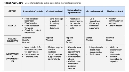
After creating a few personas, I complete the user journey map. One example is below.

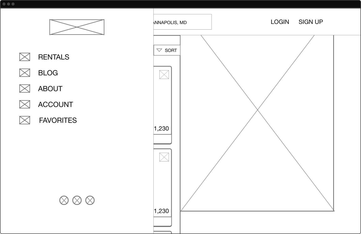
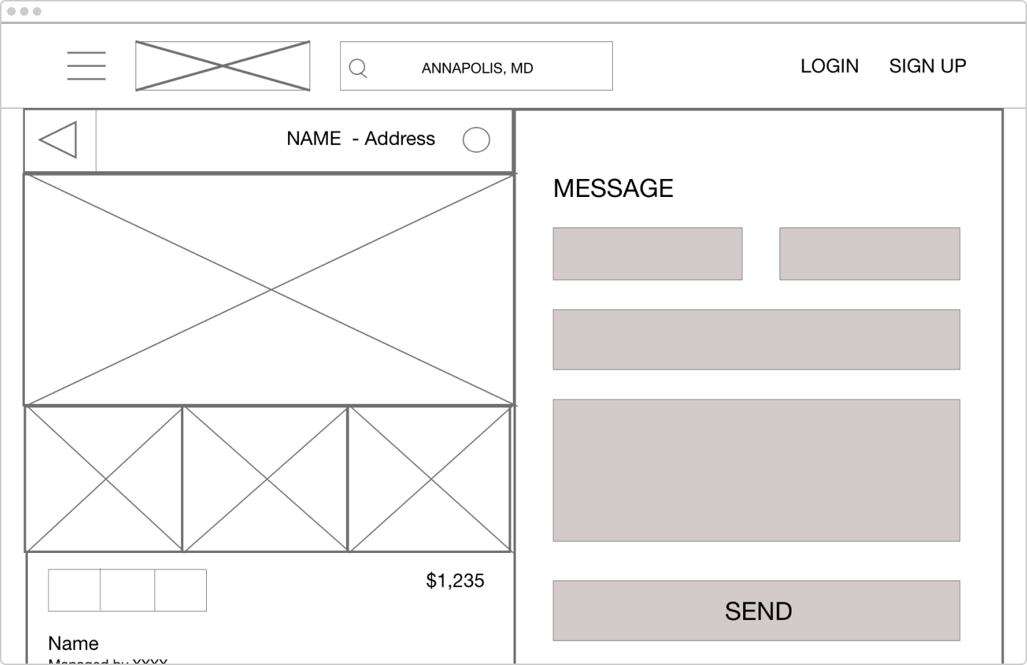
The low fidelity prototype was next.
After completing the lofi prototype, it was time to test it to the wider world. I gathered some participants and had them search for properties and view listings. Though there were no major issues, a few improvements were requested. Users wanted a way to favorite and share rental listings. They also wanted an easy way to request a tour. These requests would be addressed during the next phase: mockups.
Keeping in mind all the notes I took during the usability study, it was time to take the design to the next level. Below are some of the mockups I completed.

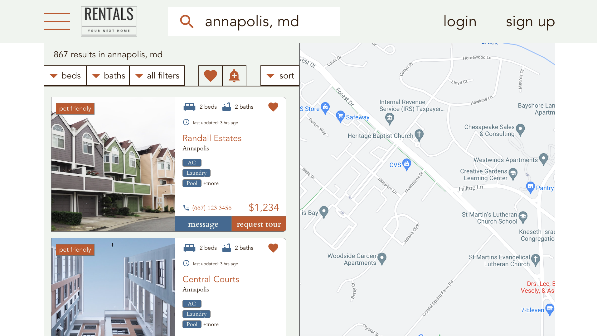
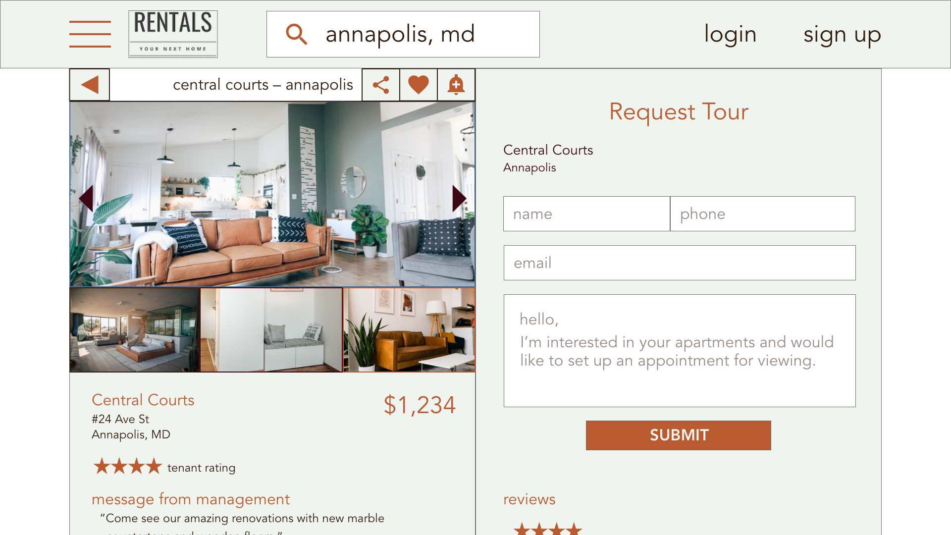

I linked it all together for the hifi prototype. After that, it was time to do a final usability study and consider the next steps.
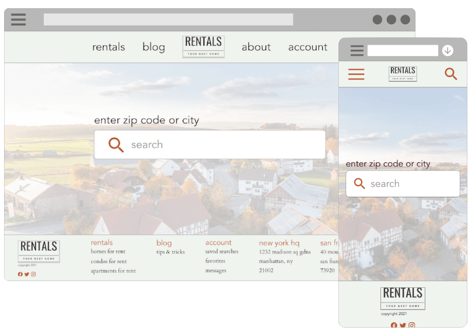
This project was a good experience in designing for different screen sizes. Because of the limited real estate (pun intended) on mobile view, hiding away items in the hamburger menu were vital in keeping the design from getting cluttered.
For the next steps in this project, I would like to concentrate on more accessibility options. Adding in options like audio input to the search bar will go a long way into making this project more accessible.

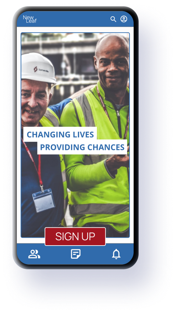
Website, tablet & Android/iOS app
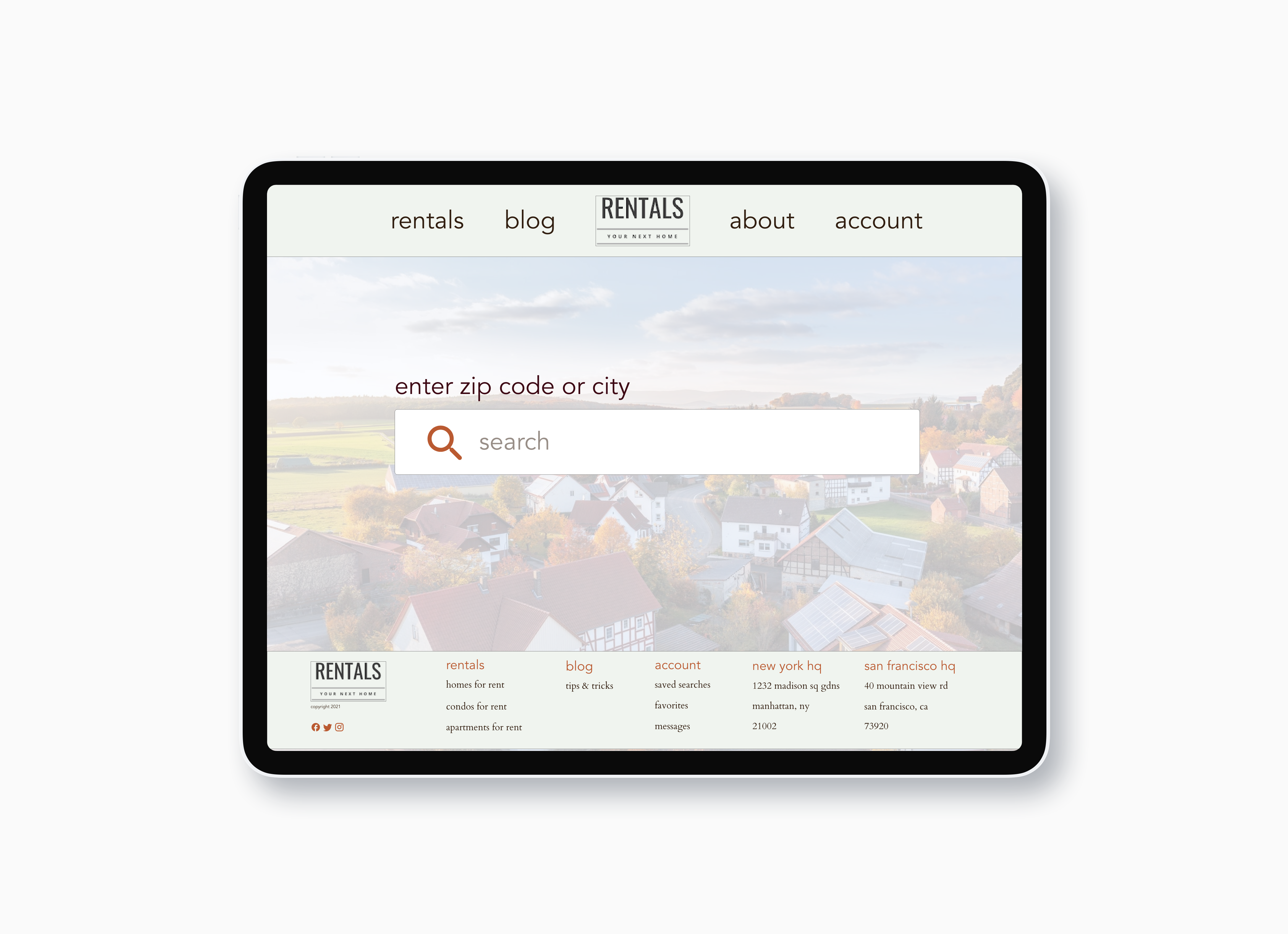
Website & tablet
Android/iOS app